Thursday 17 May 2012

Dennis Pederson - Still Life

When researching I came across this photographer. I felt I should include his work in my blog because he does very interesting still life work. My photography is very varied but I felt I needed some more still life inspiration.


I find the image above very beautiful and very visually interesting. There are lots of different jewellery pieces which are situated on snow. This advertising campaign could help boyfriends or husbands find a potential gift for their partners at christmas. The snow also features berries and some leaves which could signify what time of year it is. All of the jewellery is lit perfectly, highlighting every diamond or gemstone. The snow appears to be untouched, this gives a fantasy theme to the image. Untouched snow often appears in movies and on television. 


By researching this photographer, I have learnt that seasons are very popular to include in advertising campaigns. And there is many different ways in which to do this. This advert is advertising Chanel summer collection nail polish. The photograph shows the shadow of the flower inside of the nail polish pot. I have realised this is to portray the sun shining on the flower; this again emphasises summer. The colours in the advertisement are also very vibrant, again showing bright summery colours. 


This advertisement is selling the product Loverdose perfume by Diesel. The background shows the perfume bottle smashing through a glass panel. The background is chaotic and cracked immensely. This shows action and power. 


Mario Testino

I wanted to include some of his work on my blog as I feel it would be very inspiration. I really enjoy the lighting techniques that Testino uses, his work always looks flawless and perfect. I want to produce some beautifully lit image. I want to have the confidence to do some further work in the studio using the Bowens lighting kit.


I really like the image above by Mario Testino, it's very modern and edgy. Harsh lighting has been used to light the model; this gives the image an openness feel. It also gives the photograph clarity by being so clear and flawless. The lighting has highlighted the models facial structure perfectly and also causing a shadow underneath the models chin and jaw line. The backdrop is a cool blue/green colour, this helps to create a calm atmosphere. However, this doesn't match the models fierce and wild facial expression. The styling of the model is modern and edgy;  


The image above is very feminine. The lighting is very soft and gentle, and has only lit one side of the models face. The other side is totally shadowed. This adds a mysterious side to the model, adding a devious and dark side to the image. The model has been lit from the front and photographers right hand side and a slightly above angle. This can be seen from how the models facial and upper body structure is highlighted. The models lace glove features small delicate flowers on it. This could represent the models personality and nature.


I have decided to include this image in my blog, as it is a location shoot. I particulary like the contrast between the shabby and battered wall and the perfect model. The lighting makes the models skin glow a golden tone. The composition uses the rules of the thirds. This is the damaged pillar on the right, the model in the centre and the bag she is holding on the left. I feel the intention of this photograph was to advertise the clothing featured. Personally my eyes are instantly drawn to the pristine cream/white dress.


I decided to include this photograph in my blog as I really like the busy and chaotic atmosphere being caused. The arms and motion blur of the arms help to show the action must be going on in the scene. This is a behind the scene shot of Kate Moss modelling, having touch ups and alterations done to her outfit in-between shots. I like how contrasted the black and white is, it gives the model a sense of importance and authority. The lighting on this image is quite harsh, a flash has been used. The reflection of this can be seen in the models sunglasses. The flash has picked up detail which natural lighting perhaps may have not.


This is another image shot by Mario Testino. The intention of the photograph is to advertise mens fragrance Versace. The concept of the aftershave is to show the viewer that by purchasing this product, they will instantly have sex appeal and attraction from the opposite sex. The position of the hands show a sense of passion and lust. The female model also appears to be naked. Men viewing this advertisement may actually believe that the aftershave could make this scenario happen to them. This obviously is not the case. This image has been shot using a flash, that is very subtle and soft on the models skin. The flash has also been aimed at the top half of their bodies. This is evident because detail of the females naked body has not been highlighted, intact her body is shadowed. 


This image was taken for an advertising campaign for Burberry London, this is an English clothing brand. The brand has a history of being quite expensive and very luxurious. The setting reminds me of the interior of a glamorous English home. The styling on this model appears to be quite unusual. The model is dressed in jeans and a casual t-shirt along with an expensive looking coat. I feel the intent is to make Burberry seem affordable and more casual. This is because the styling in the image is very laid back. The image has been lit with a flash, this is quite evident. The right hand side of the image is lit perfectly, the model is lit all over evenly. However, on the left hand side there are darker patches. These can sometimes appear when a flash is present. 
The model is featured off centre, this is unusual for an advertising campaign. The clothing or product being sold usually takes up nearly the entire frame. The models stance is confident, and also quite strong. His expression is very serious implying the company 'means business' literally.


Perception Photography


per·cep·tion/pərˈsepSHən/

Noun:
  1. The ability to see, hear, or become aware of something through the senses.
  2. The state of being or process of becoming aware of something in such a way.


I have named this project perceptions. I did this project a while back, including images of many different people. I used Photoshop to create different layered images. So I used an image of an eye but layered another photograph over the top of it. As if this is what that particular eye was seeing. I started off by researching various images of eyes that I felt were unusual or interesting. 


Although the image above is only a stock image it shows the idea which I wanted to make my own. The eye features a world map around it. This could potentially mean this person wants to see and travel the world. The eye colour has been changed, this makes the eye tie in almost as it is part of the map. The position of the eye on the map could also indicate where the human comes from or lives presently. I like how each of the images could portray several different meanings. 


The image above shows how high quality my images will need to be. The photograph above has been highly edited creating a highly contrasted photograph. The iris of the eye is strong and almost looks like electrical currents. 


The image above inspired me most as it had another image Photoshopped into it. The fish water and bubbles have all been photographic manipulated into the image. 


Examples of My Work


The image above is one of my final images. I am quite pleased with it, as i feel the editing worked really well. This image was produced by taking a photograph of my grandmas face and overlaying an image of entwined blossom branches. 


This image is a self portrait which has then been over layered with a busy night road scene. I think the two work well together and create a very unique outlook. The image uses use of lines which draws the viewers eyes right the the centre of my photograph (my eye). 


I like the patchwork effect that was made through editing this photograph of an eye. The colours work well together and match the iris of the eye in the image. I colour burned the eyelashes the make them bold and stand out. 

Equestrian Photoshoot

I have wanted to do this idea for a long time and finally researched into equestrian photography.

These albums on flickr have helped me to be inspired;

http://www.flickr.com/photos/vagabondvistas/3674054380/

http://www.flickr.com/photos/vagabondvistas/3673243157/

http://www.flickr.com/photos/vagabondvistas/3674054548/

After viewing these albums I felt inspired enough to do my shoot for my client.

Brief


The client wanted some portrait photographs taking for a family album including the family horses.

The Photoshoot
The shoot was on location, taken on private land. Risk assessments have been done in order to help the health and safety of the models and myself.


Paul Politis Black & White Photography

Paul Politis


Artist Statement


Paul Politis

In my photography, I attempt to capture moments in time that have a quiet emotion to them. I tend to avoid human presence, instead focusing on the objects that humans construct, maneuver and discard. Through patterns and shapes, and light and shadow, I hope to kindle in the viewer an empathy for the objects I photograph, or to view them as a personification of a part of themselves.

Working primarily in black and white, my recent work has focused on these themes within an urban landscape. I feel that the concrete and asphalt of a city imparts a cold and lonely feeling that is further accentuated by the tonalities of a black and white photograph. The city is rife with still lifes and juxtapositions, waiting to be photographed.


I have decided to include this photographer in my work because I feel my work has been focusing on still life projects. Also much of my recent work hasn't really included people. I thought I would find this photography interesting and inspiring to my personal work.


The first thing that I notice about this image is the bold contrasted black and white tone to the photographs. I also looked at this photographer when I did my AOP ballet project. 

I really like how the photographer has captured a natural quirky element in the countryside. The leaf has naturally formed a heart shape, this could represent passion for the rural countryside. The photograph features many different shapes and patterns in the image making it visually interesting. The main thing in the photograph is the heart leaf. The viewers of the image are instantly drawn onto the centre of the photograph. 

The use of lines is also present in this image. The shape of the vine on the plant also draws the viewers attention to the leaf in the centre. 


The plants on this windowsill are almost silhouettes, this is due to the natural lighting coming through the window. Using natural lighting loses detail and highlights which would be present if a fill in flash would have been used. I feel rule of the thirds is being used in this photograph, this creates an interesting composition. The image has a very lonely and isolated feel to it. I think this is due to the very bold tones, and the space between each potted plant. 


I like how the graffiti in the image overlaps and intertwines each other. This creates a very crowded and chaotic effect. This is completely different in comparison to the previous image I have included in the blog. The different elements of text seem to appear as different layers. This is due to each being separate, some being older than others and also being wrote in different paints by different people.
I like the idea of graffiti having many different meanings to different people. Phrases such as 'peace for all' can be seen on the image. The setting appears to be urban, the text creates an abstract and modern work of art.


Although the image above isn't black and white I really liked the idea and concept. The photograph shows a corpse like model lying dead and silent to the surrounding world. Depth of field is present in the photo, the photograph has focused on the models feet and body. The focus drops out again towards the top of the image. 

The photograph has been taken at night. This is evident due to the black sky and also the lens flare of the lights. Lens flare is usually like this when a long exposure and high ISO has been used. My blog has shown some of my night time photography where I have been experimenting. The tone of the photograph is really nice, but I personally feel it doesn't match the subject. I was expecting a very cold tone to match the eerie atmosphere. 

I feel this image could be displaying an urban attack which has happened in the dead of the night. 

Many textures are evident in the image, like the graffiti photograph this seems to create many different layers. 


The viewpoint is quite unusual and different to the 'norm'. The camera is shooting down at the door. The setting looks as if it is from a horror movie, it is very isolated and eerie. I think the angle has been chosen to emphasise the distance to the door. The door also appears to look quite small. The image could include a hidden message, communicating to the viewer that this is such a mysterious place; even your own mind begins to play tricks on you. 

Other details can be found around the photograph, such as broken pieces of wood. Dirt and mud is also features on the stairs showing the house isn't a home to anyone at present. This shows a sense of abandonned and aloneness.   


I really like the natural lighting that has been used in the photograph above. The lighting seems to have created a holy 'cross' like shape. The shadows create a creepy and uneasy atmosphere to the photograph. The vintage looking radiators gives the viewer knowledge that this is either an old building, or an old photograph. 


The bold window frame is silhouetted by the natural lighting coming in from the other side. 

Shock Art

Shock Art

Shock art is contemporary art that incorporates disturbing imagery, sound or scents to create a shocking experience. It is a way to disturb "smugs, complacent and hypocrital" people.

More information about shock art can be found here: http://en.wikipedia.org/wiki/Shock_art 


Controversy - Controversy is a state of prolonged public dispute or debate, usually concerning a matter of opinion.


The canvas above is of famous child killer and molester Myra Hindley. Ironically the artist has used children's hands dipped in paint. This canvas was done by artist Marcus Harvey. The colour scheme is dull and depressing, creating and eerie atmosphere. 


The image on the left is titled 'Piss christ', being controversial seems to play a key part in marketing and selling art/photography. Many people will be offended that christ has been places in urine, many opinions will be made about this image. 

Wednesday 4 April 2012

Health Campaigns

Photo Shoot One & Two - Lungs


After being inspired by the work of Oliver Toscani, I have decided to proceed with my work and take some photos. 

This is an image which was taken in the first photo shoot which I have done. I worked in the studio focusing the lighting of my work. The subject featured in the image is a 'pigs pluck'; this is the lungs of a pig. I felt these looked realistic and when edited would create a repulsive and graphic effect. I wanted to created a shiny and 'sheen' effect of the organs. This had been previously inspired by the work of Toscani. A small amount of gelatine was used and spread over the organs. This was so that when the lights triggered, this produced a nice shine to the subject. 

I feel i have captured the composition of the lungs well however, I felt they looked too healthy and colourful. The lungs were supposed to be an example of smokers lungs, or someone who had lung disease. I decided to play around with the photograph on Photoshop. 


Above shows the image after being edited on Photoshop. The background colour has been changed as I felt the photograph would work better on a black background. This means the set of images would have to take this colour background so the images are consistent and work as a set. 

The selective colour tool was used to detract any bright tones, and the vibrancy tool was used to reduce any colourful areas. Colour burning was used to darken areas of the lungs, this can be visible on the patchy dull areas on the lungs. I personally felt this worked really well. 


The image above was also taken by me, this was to accompany the image of the lungs. I wanted to include a message about smoking through the use of a 'ticking time bomb' mechanism. The lighter represents that every time a cigarette is sparked and smoked, it's a step closer to start 'alarm bells ringing'. In a literal sense, this could be due to a disease or ]condition caused by smoking. 


The original image (shown above) featured a light grey background, but I decided to change this so that this could tie in with the photograph of the lungs well. I highlighted the clock face, paying careful attention to sharpen the numbers and hands of the clock. I asked some viewers what they thought of the image, and they said it was too literal. I don't agree, as I feel it works well and is straight to the point. To make the background black I had to use the brush tool and go round every element on the photograph. This is a time consuming process but I felt it was worth the final outcome. 


Photo shoot Thee,Four & Five - Heart


The image above was taken from a test shoot I did of a pigs heart. I liked the idea and concept but after having a  VIVA with my class, it was discussed that having the organs consistently photographed in the same style and technique may work better. 
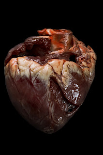


This is my third final image which has again been edited using Photoshop. This image was difficult to edit after going round the entire organ with the brush tool. Some areas were hard to carefully define but I feel I managed to improve this after going over it a few times. I like the overall effect this photo has. It appears to be very gory and would hopefully convince viewers to take actions to care about their heart more. 


This image was taken to go as a triptych alongside the heart organ. I use a black background when shooting but it obviously wasn't dark enough. Again, the consistent background was kept by using the brush tool. One of my tutors felt the images look 'cut out' and didn't look right. Personally I liked this effect and decided to do this through all of my images. 


This image shows the photograph after the post production stage. I have purposely included a shadow which goes over the legs. I wanted to do this to show 'obesity'. I also used the liquify tool to make the legs look wider and fatter. However, it was difficult to do this without making the image look very fake and edited. Only slight changes have been made with this tool. This is the fourth final image for my project.


Photoshoot Six & Seven - Liver


These two photo shoots are the ones that I struggled with most. Unedited this image was really hard to identify. When displayed with the other two organs I feel that the liver will look better and people will recognise it. Being honest, nobody really knows exactly what a liver looks like. I love the glossy effect which has been caused by gelatine being put on the organ. When the flash triggered it caught the gelatine and caused a sheen effect.


This is my least favourite image which I produced for the project. After losing my SD card, I lost some potential final images this caused me to have to do a photo shoot the night before the deadline. The background isn't consistent which I feel ruins the image. My flash gun was also playing up making the photo shoot very difficult to complete. I altered tones and the brightness and contrast of the photograph. 


Overall I feel happy with most of the images I produced. I worked very hard and spent a lot of time and effort editing all the images to a professional high standard. In retrospect I wish I would have allowed myself more time to do more photo shoots. I feel this would have improved a couple of my final images vastly. Before the exhibition I would like to re-shoot the toilet photograph as I feel it doesn't show off my best work.